INSERTS OF ROLEX AND TUDOR DIVING WATCHES OF THE ROLEX ACRYLIC ERA
INSERTS OF ROLEX AND TUDOR DIVING WATCHES OF THE ROLEX ACRYLIC ERA
researched and written by Xeramic (Link)
© 2021/2022, all rights reserved (sharing by link and without commercial use explicitly permitted and expected)
1 INTRODUCTION
2 SIDE EFFECT
3 THE MAKING-OF
4 LEVEL OF DETAIL
5 MISPRINTS
6 COLOR AND SURFACE VARIATIONS
7 DIMENSIONS
8 SPOTTING THE VERSIONS
9 NUMBERING OF THE VERSIONS
10 VERSIONS
11 BACKS AND BORDERS
12 LUME PEARLS
13 HOW TO USE
14 A WORD ABOUT FAKES
15 FINAL NOTES
1 INTRODUCTION
This is an in-depth article about the contemporary bezel inserts of Rolex and Tudor diving watches of the Rolex acrylic era (so, up to 1990, with the very last pieces of the ref. 5513 – I didn’t extend my research to the remained years of the last Tudor acrylic Sub ref. 79090).
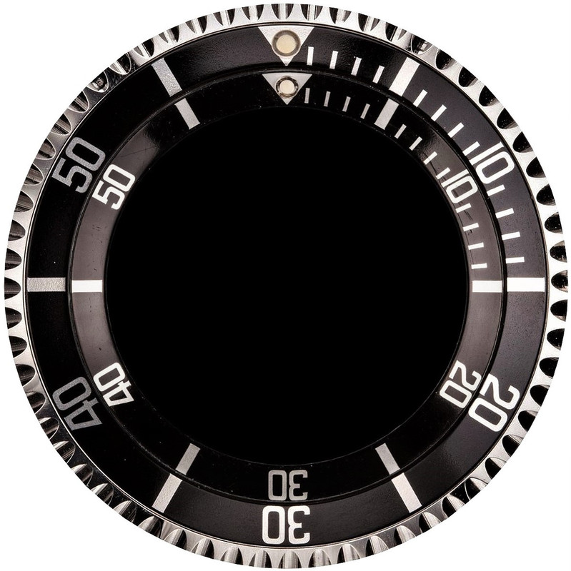
Besides of the dial, the insert is the most esthetic-relevant and – due to aging/wear – also the most individualizing part on vintage Subs or Sea-Dwellers; fully exposed to environment conditions but not to refurbish, it’s a highly sought-after and valuable spare.
The goal of this documentation is to enable you to identify any era-conform version, to distinguish genuine from aftermarket stuff as well as correct from incorrect watch configurations, and – thanks to the detailed font descriptions – to spot versions even on blurry or incomplete images; further, to eliminate common uncertainties in regard to dimensions, surface properties, color variations, back profiles and lume dots.
2 SIDE EFFECT
I’m well aware of the risk of feeding forgers; however, genuine inserts and therefore perfect templates are available anyway – I do not add here anything; to draw your attention to the details of original parts means at least to blow off all current aftermarket products and to force the guys to restart instead of let them already flood the market.
3 THE MAKING-OF
To understand how to differentiate inserts at all and about what level of detail we talk, you have to be aware of their making; all inserts in question got made by a colorless anodizing and a subsequent dying of aluminum slugs – here’s a simplified description of the production steps:
- a template of the layout got etched by a photo-chemical process as a deepening in a steel plate – the so-called “cliché” (French for printing plate)
- aluminum slugs (already with the bore for the lume pearl if the version got any) got treated with a pickling agent and rinsed in distilled water, to achieve a perfectly grease-free and homogenous surface
- the slugs got anodized in an electrolytical bath, to build on their surface a crystalline, transparent, antistatic, porous and very hard oxidation layer (a chemical bond of aluminum and oxygen, also known as electro-corundum, with a hardness of 9 on the Mohs scale where diamond is a 10… you can just still scratch it because the layer measures only 10 to 20 micrometers and the supporting aluminum is relatively soft) and rinsed again, to clean off the bath agent
- the dye for the layout – gold or silver color (yes, silver too; to leave the etched and anodized aluminum blank wouldn’t result in the same shiny silverish tone) – got applied with a spatula in the deepening of the cliché, and the surface of the latter got cleaned with a doctor blade
- a soft silicone pad got lowered on the cliché, to adopt the layout as dye from the deepening, and lifted again
- the pad with the dye got lowered on an anodized slug, to print the layout on or rather in the crystalline oxidation layer (the pores absorb the dye), then the slug got rinsed again, to remove dye residues from the surface
- the cliché and the pad got cleaned and the printing repeated with a masking substance, to protect the layout on the slug from the next step
- the slug got plunged in the second dye – black or blue –, to color the unmasked pores of the layout environment (including the back), then rinsed again, to remove dye residues from the surface
- the masking substance got removed with a solvent and the insert rinsed again, to clean off the solvent
- the insert got plunged in a sealing solution with nickel acetate, to close the pores and thereby to encapsulate the dye, and rinsed again, to clean off the agent
(about the masking: you cannot fill pores twice, like one color over the other – but a masking is necessary anyway, to avoid unwanted interactions between the dyes)
For a third color (red triangle) just vary the steps; the result was an item with a brilliant layout, perfectly sealed in an antistatic, dirt-repellent, highly corrosion- and scratch-resistant layer; and there, you have also the explanation why any alleged original with a simple on-top-printed layout is fake (visible at the latest when scratches in the layout reveal the second dye instead of blank aluminum beneath).
I might be wrong in some techniques/step, but this doesn’t matter – my main points are the making of clichés on the basis of templates (a compelling conclusion, as you’ll see later), and the pad printing; pad printing means, fundamentally, all printings made with one cliché created the very same font/layout properties – a specific version.
4 LEVEL OF DETAIL
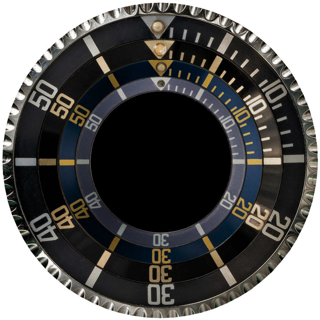
The precision of the printing was extremely high; not only the general style of characters, markers and possible serifs but also the tapers/curvatures/angulations of the font lines within a version series were always the same; however, over time a cliché with high usage got worn, the edges of the deepening abraded – this resulted in an expanded and “blurred” layout with fatter lines, shrinking enclosed areas, shrinking gaps between the digits, fuzzy or even disappeared details, and finally in slightly changed character shapes; for this reason, the appearance of a version can vary nevertheless.
Regarding the precision compare these two samples of one version:
fig. 1: congruence

Check the exact course of inner and outer lines/curves… the serifs… where are bulges… were does the thickness of the line change… and get absolutely used to perceive the shape of the partially or completely enclosed black areas too as your eye and brain can recognize and therefore compare compact forms better than complex line paths.
The match is striking, although the lower sample is a bit fatter and the font has a height of two and a half millimeters only… impressive, but that’s not yet the end, we go further:
fig. 2: into the details

These are macros of markers, three samples of one version, with just modestly increased fatness from sample to sample.
On the top sample, the presence as well as the individual shape and orientation of any serif is well visible – and to give you an idea of the precision: the width of the small marker is about 0.25 millimeter and the length of its lower left serif about 0.03 millimeter only; there’s even a lower right one, measures maybe one hundredth of a millimeter… there, we reach the limit of the accuracy and you might find some variation even with examples of the same fatness – but otherwise, put ten in a row and all are exactly the same (except for misprints, like explained further below, and with a bit more tolerance for early versions because of the technical limitations of those times).
Now check the two other samples: with an increasing fatness, all “swells” – shapes change gradually, details like the mentioned serifs appear less accurate as they do not only swell too but get also “eaten up” by the main part of the character; anyway, the version is still recognizable thanks to the high basic conformity.
At some point of the cliché wear, the printing became so fat that a character touched another – known as “kissing 4”; obviously, this is not a font or a layout property, just a printing effect; you can well call it “kissing 4” to describe the manifestation, but it’s not an own version – easily to prove:
fig. 3: a “long 5” version with increasing fatness up to “kissing 4”

fig. 4: a “hooked 5” version with increasing fatness up to “kissing 4”

In the past, this manifestation got misinterpreted as an own and early version “MK1 kissing 4”, and people erroneously mounted very fat but later “hooked 5” inserts on gilt watches.
With further increasing fatness, even more digits (with initially larger gaps between them) can “kiss”, like here with the 50 of the same two versions as above:
fig. 5: extremely fat “long 5”

fig. 6: extremely fat “hooked 5”

As some font details got lost, very fat printing is harder to authenticate: spot the details on a thin printed execution, then look for their residues on the fat one – imagine the layout as a rising dough, to get a good feeling for this kind of natural change.
Because such hefty fatness occurred with high volumes only, there exist no extremely fat “skinny 4” or Milsub inserts, for example.
Theoretically, a version might have got produced within a short time for stock and the mixed (thin to fat) output subsequently used mixed up over time as well - but a) to preproduce such a huge stock wouldn't have made sense as there was no safety about the future need of the particular design, b) I highly doubt in the production capacities of that time to preproduce such a quantity, and c) the analysis of likely untouched watches shows a progress of the fatness in accordance with a timeline; thus, "fatter" means also "later made".
5 MISPRINTS
So, the font/layout properties of a version are fundamentally given – deviation besides of the fatness effects means another version; exceptions are misprints, like double strike, shifting, bleeding or incomplete printing:
fig. 7: double strike (of the layout masking – thus, not only the already applied silver printing but also some blank aluminum alongside got not covered by the black dye)

fig. 8: shifting of the layout (on this sample to the left)

fig. 9: bleeding

fig. 10: incomplete printing

Bleeding or incomplete printing can be minimal, so not any bulge, missing serif or shortened line is a clear sign of a fake (or of an undiscovered version); if you notice something like that and suspect an aftermarket item, examine all other details and look for an obvious exclusion criterion, like a surplus or misoriented serif, a wrong font height or incorrect angles/spacings.
Such manifestations got caused by a failure in the printing procedure (polluted or damaged pad, handling error, bad dye mixture, unusual environment temperature or humidity, defective machine, etc.) and are, depending on the failure, individual/unique or at least seldom.
Don’t confuse that with an insert made with an imperfect cliché, like we see it for example with the right upper edge of a 0 of the Milsub insert:
fig. 11: Milsub insert with incomplete 0

There, the template for the photo-chemical etching was surely fine but the etching of the cliché not done properly (a possible explanation follows in paragraph 10, with the description of the MK5.1); undetected or ignored, it got used for all MilSub inserts, and as a result the defect became a given font/layout/version property.
6 COLOR AND SURFACE VARIATIONS
Last but not least, started with the “hooked 5”, the inserts came in the additional color variants black/gold, blue/gold and blue/silver, complying with the new gold cases and/or blue dials (except for the earliest black dialed ref. 1680/8 with black/silver inserts, when there were no black/gold inserts available yet – very likely because of a planning or supply mistake); they do not represent own versions.
The blue/silver executions were made for Tudor Subs with blue dial only; up to and including the MK6 (of the new typology, see paragraph 10), they came with a grainy surface caused by sanded slugs – I assume for marketing reasons in regard to the first sports models with a blue dial: to differentiate the luxury blue Rolex ref. 1680/8 with its shiny dial from the common blue Tudor Sub with its matt one, they emphasized not only the different shades of blue but also the different dial surfaces by appropriate inserts.
fig. 12: Rolex blue ref. 1680/8 vs. Tudor blue ref. 7021/0

The different surfaces let you recognize alleged “former black Rolex inserts, faded to blue”, which were/are simply faded blue/silver Tudor inserts; and blue smooth Rolex inserts on Tudor, which seem at first glance silver printed, but are just faded gold (this is valid up to and including MK6 – all later Tudor inserts got a smooth surface as well).
All the same printing version anyway:
fig. 13: one version, different colors and surfaces

To sum up: a single printing version can show
- increased fatness with appropriate effects, caused by the wear of the cliché
- defects, caused by unique or temporary production fails
- defects, reproduced from an imperfect cliché
- different colors, due to an individual dying
- different surfaces, depending on the slug
You have to understand these variations to safely identify versions and to distinguish genuine from aftermarket products.
7 DIMENSIONS
To comprehend the wide versions spreading described in the next paragraph, you should previously know that all inserts for acrylic Rolex/Tudor diving watches have the same inner and outer diameter specification, 30.30/36.55 mm, respectively; but the inserts as well as the bezels and crystal retaining rings show production tolerances – often, Rolex had to widen or squeeze (google for Rolex tool ref. 1006) the bezel and/or the ring to build well-fitting individual combos; so, you can have several untouched watches of the same reference but the bezel parts might not easily be swappable anyway.
People only offer inserts for particular models because they took them from particular ones, or because they mistakenly believe in a “size family”; and although original packages are labeled for a specific model, this is for supply and design (surface/colors) reasons only.
8 SPOTTING THE VERSIONS
To show you the reliability of the information, I like to explain my approach:
- researching/studying/documenting the versions
- counterchecking of about 5’800 acrylic Subs/SDs on the net, to make sure that I’ve caught any version, to accumulate additional pics for comparison and to feed a version-to-year statistic for the dating (started it a bit delayed, thus, with 3’700 entries only); I’ve inspected all offered and sold pieces of dealers with well-structured data pools and high-resolution images, like HQ Milton, Lunar Oyster, Oyster Palace, Tropical Watch, Craft & Tailored, Sheartime, Wanna Buy A Watch, SubGMT, 10 Past Ten, Exotic Watches, Bulang and Sons, Vintage DB, Momentum Dubai, Sweeping Hand, Ancienne and of a few more
- crosschecking of the accumulated pics, to ensure I’ve not overlooked any sub-version
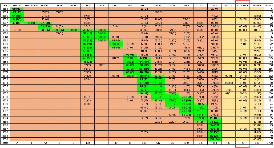
And then… it became complicate; I had all versions and some corresponding data with finding peaks (or at least clusters) – however, the transitions appeared not too clear; to localize the beginning and the end of a run around a peak/cluster on the basis of necessarily lower numbers (either just increasing or already declining again) was a challenge, as because of insert replacements lower numbers of the version in question were spread all over the place… so, difficult to differentiate low run numbers from low spread numbers; and although the percentage per year was an important indicator, there were more factors to take into account: patterns of the evolution and logical product sequences; the interaction between versions volumes; the usage of contemporary inserts as service parts on earlier watches; the influence of common misconceptions, individual taste and availability of versions in regard to private swaps; the lower demand for swaps with later watches; and so on… the result is unavoidably a mix of facts and conclusions – just my best guess:
fig. 14: versions statistic 1953 - 1990

The different output quantities are caused either by different capacities or by different occupancy/usage in regard to the supply requirements.
The periods smoothly fit in such a production model and inevitably form a cascade for each line – an end of a version got followed by the start of another one, some overlapping can be explained by the using up of small stocks (remember, the statistic doesn’t show production output but usage dates); for my estimations of the periods I took the model into account; it also illustrates that Rolex didn’t produce more than two versions simultaneously, but stock consumptions and sale delays let occasionally appear several at the same time on the primary market anyway.
9 NUMBERING OF THE VERSIONS
You’ll see sixteen contemporary versions; there’s no need to number the few round font types and the MilSub insert, so I did it just for all others; in awareness of earlier forum discussions and sales descriptions I’ve initially thought about correcting and expanding the current typology – but it didn’t work, too confusing; thus, a clean reset – that did also allow me to properly codify relations between some Marks; the following table gives you an overview of the changes:
fig. 16: table of changes

* as you’ll see further below, these are unique in regard to their coloring but not to the font/layout – however, in contrary to later color variants, they had their own (although short) period and are important/valuable and therefore labeled as an own version anyway
** outdated since years, anyway still in use; just a former misinterpretation of the “kissing” manifestation as an own version, like explained in paragraph 4
*** once called “regular” in an older thread but no common label
10 VERSIONS
For an easier version check some remarks are redundant.
The starting or final year can be more or less touched – and as mentioned in paragraph 8, for MK1, MK5.0, MK5.1, MK6 and MK7 you might prolong the runs for latecomers by a year (considered in the description headers by an additional indication in parenthesis); I’d go for the narrower dating if you have to procure an insert for your watch but accept the wider one for purchases of complete watches.
Round font versions are for no crown guards models, square font versions for crown guards models and for the late executions of the ref. 5508; besides of this allocation, versions are only period-related, not model-related (except for the MilSub insert, obviously).
Please consider: while catalogues, brochures or advertisings are often a helpful source for researches and determinations, they show sometimes incorrect or outdated configurations.
To the best of my knowledge these are all the contemporary versions – any style deviation means 99 % safely it’s an aftermarket product (the last percent is for an unlikely undetected genuine type) or a service version (which might also be contemporary for acrylic post-1990 Tudor Subs); it’s possible that more but unobtrusive subversions (or rather subseries) exist – for example, if a cliché got damaged and replaced by a very good new one, with virtually invisible deviations; however, as long as one doesn’t show a particular and well recognizable characteristic, there’s no need/benefit to spot it and enclose it in the typology.
Notice the moderate evolution of the style, so typical for Rolex; as far as possible, I used rather thin samples, as these show the details at best – zoom up (click or tap on the images for a higher resolution)!
ROUND FONT VERSIONS, CONTEMPORARY FOR NO CROWN GUARDS MODELS
NO HASH
about 1953 - 1957
black/silver
fig. 17: NO HASH
REMARK/S
Some without and some with a recess (variable sizes) for lume paste – very likely evolving over time from none over a small to a large one.
CONSIDERATION/S REGARDING THE PERIOD
For the round font inserts we see an obvious evolution from “no hashes, sometimes with a recess for lume paste” (version NO HASH) over “no hashes, standardized recess for lume paste, red triangle” (NO HASH / RED TRIANGLE, see below) to “hashes, early ones with recess for lume paste / later ones with perforation and lume pearl, red triangle” (HASH / RED TRIANGLE, see further below); so, until and including 1956, even the HASH / RED TRIANGLE findings represent just replacements (as last and because of increasing quantities best available round font version), and the square font versions are only a best approach anyway; IMO, 1957 got still touched by the NO HASH, it’s unlikely that the short-living successor NO HASH / RED TRIANGLE (seen in 1957 only) covered the whole year right from the beginning.
NO HASH / RED TRIANGLE
about 1957
black/silver/red
fig. 18: NO HASH / RED TRIANGLE

REMARK/S
With recess and a centered tiny perforation, which probably served as a "holder" for the lume paste; a very heavy font.
CONSIDERATION/S REGARDING THE PERIOD
Known for 1957 only – and indeed, I didn’t find any in other years.
HASH / RED TRIANGLE
about 1957 - 1959
black/silver/red
fig. 19: HASH / RED TRIANGLE

REMARK/S
Earlier ones with recess for lume paste, later ones with perforation and lume pearl (the earlier type is rarely seen – probably, most got later perforated to take a pearl too).
CONSIDERATION/S REGARDING THE PERIOD
Very likely, this version replaced the NO HASH / RED TRIANGLE still in 1957 – otherwise, we would see the latter up to 1958; in use until 1959 (as then, only the new crown guard references Rolex 5512 and Tudor 7928 got the first square font insert version yet – I don’t believe in the idea that ref. 5508 got it already too, that combo isn’t common at all).
SQUARE FONT VERSIONS, CONTEMPORARY FOR CROWN GUARDS MODELS, PLUS FOR THE REF. 5508 EXECUTIONS 1960 - 1962 (to show differences as well as some correlations, there are now additional versions comparison pics – also for demonstrating the evolution)
MK1R – LONG 5, CURVY FONT / RED TRIANGLE
about 1959
black/silver/red
fig. 20: MK1R

REMARK/S
The font of the MK1R (and of the MK1, the quickly following all-silver printed variant made with the same cliché) contains a long 5 and is curvier than the one of the similar and parallel running MK2R (and its follower MK2), thus the label; there exist no particular fat printed examples because of the short run – should you see any “kissing 4” with a red triangle, don’t believe in the red as it’s a MK1 with later added red paint.
Compare with HASH / RED TRIANGLE to see the change from a round to a more squarish font:
fig. 21: MK1R (outer) vs. HASH / RED TRIANGLE

Besides of style reasons, that might also have got done due to an improved printing quality, allowing the creation of sharper, more detailed fonts.
A few MK1R and almost all MK1 show an interesting detail; somewhen during the making of the MK1R series, a tiny flaw on the inner edge of the 0 of the 50 occurred:
fig. 22: “PIMPLE” ON MK1R/MK1

There, the cliché got either damaged, or a material defect came to light; most MK1R don’t show it yet, but for the following MK1 it became a font/layout/version property; usually, you can notice it even on blurry pics – otherwise ask for macros or reduce the pic exposure; this particularity is for several reasons exciting:
- it’s a hard proof for that the MK1R cliché got used on for the MK1
- a MK1 without that pimple (or at least with a slightly bulged line section) is suspicious as long as the printing is not very fat (then, the former sharp details got lost because of the wear of the cliché, like explained in paragraph 4)
- check any alleged MK1R with a pimple twice and trice as it might be a later red painted MK1
This is another nice sample for the details you have to look for; as demonstrated, the printings show a very high consistency – thus, focus on such tiny regularities, unobtrusive but present, as an additional checkpoint to distinguish genuine from aftermarket inserts; go back to fig. 3 and check the pictured MK1 samples again, and you’ll notice that little guy – indeed, you’ll never look at this version again without searching for the pimple!
CONSIDERATION/S REGARDING THE PERIOD
Released with the new crown guard references Rolex 5512 and Tudor 7928 (this is not a particular version-to-model link – there has just not been other crown guards target models yet) in 1959 and very likely used on the earliest executions with square and eagle beak crown guards only; the low number of findings reflects the rarity of those model executions.
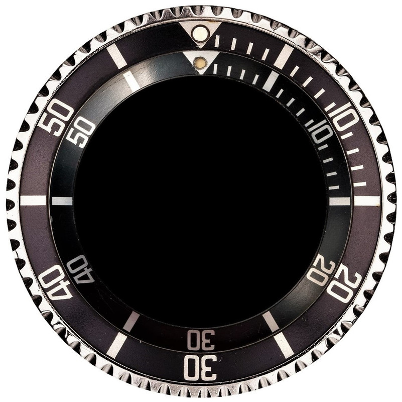
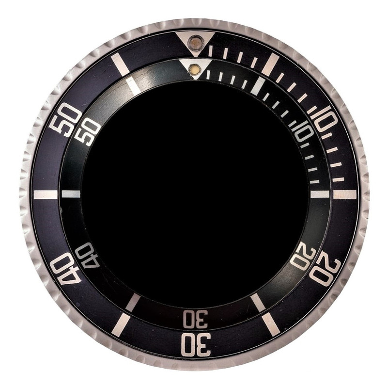
MK2R – LONG 5, EDGY FONT / RED TRIANGLE
about 1959
black/silver/red
fig. 23: MK2R

REMARK/S
The font of the MK2R (and of the MK2, the quickly following all-silver printed variant made with the same cliché) contains a long 5 and is edgier than the one of the MK1R/MK1, thus the label.
Comparison with MK1R:
fig. 24: MK2R (outer) vs. MK1R

As this is the first comparison of two similar versions, I like to remind you of the details to look for; you might think: “Well… on the MK2R, the angulation of the back of the 2 is edgier, and the lower end of the 3 is more open!” – and you’re absolutely correct; but did you also notice that the back of the 2 goes down from thin to thick, while it’s vice versa on the MK1R? Or the different “knee” shapes of the 2s? The lack of serifs on the MK2R (except for tiniest ones on some markers), whereas the MK1R shows some? And the 4s – are they identical? Yes? But what about the position of the outer angulation in relation to the vertical dash… the length of the protruding end of that dash? Even the 0s are different, MK1R with thicker sides; in fact, all digits differ here as well as most of the markers; so, it’s all about the accuracy of your viewing.
There exist no particular fat printed examples because of the short run – should you see any “kissing 4” with a red triangle, don’t believe in the red as it’s a MK2 with later added red paint.
The MK2R (as well as the MK2) has a special back, for details see paragraph 11.
CONSIDERATION/S REGARDING THE PERIOD
Of the particularly rare MK2R I’ve found only loose examples (and added the “00” percentage just for a better reading), but obviously it started and went parallel with the MK1R.
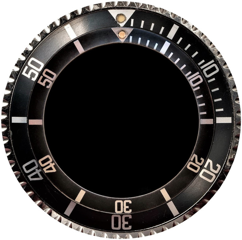
MK1 – LONG 5, CURVY FONT
about 1959 - 1968 (1969)
black/silver
fig. 25: MK1

(noticed the pimple ;) ?)
REMARK/S
The all-silver printed variant of the MK1R, printed with the same cliché – compare:
fig. 26: MK1 (outer) vs. MK1R

CONSIDERATION/S REGARDING THE PERIOD

The uniform layout coloring started very likely right after the handful of red triangle executions for the ref. 5512 and 7928 case prototypes with square and eagle beak crown guards, still in 1959 and with the pointed crown guards cases; probably, the red got abandoned because its particular wavelength becomes absorbed as the first of all colors by the water and you cannot perceive anything else than its contrast – not helpful in diving, what might well have been the feedback of the square and eagle beak testers, together with suggestions for a smaller crown guard (for an easier operation of the winding crown while wearing dive gloves); remember, Rolex made these tool watches for divers, not for shop windows only.
On no crown guards Subs, this version got used as main service item (main successor, and later the best approach to the hard to get and very expensive round font versions), this is the reason for the relatively high number of findings on earlier models; the lower percentage in 1963 matches the parallel run of the short-living competitor MK3; a sharp drop in 1968 marks the use up of the stock and thus the end of the run – on the major production line, the MK5.0 took over.
MK2 – LONG 5, EDGY FONT
about 1959 - 1962 (?)
black/silver
fig. 27: MK2

REMARK/S
The all-silver printed variant of the MK2R, printed with the same cliché (and like the MK2R made with a special back, see paragraph 11) – compare:
fig. 28: MK2 (outer) vs. MK2R

CONSIDERATION/S REGARDING THE PERIOD

Started together with the MK1; again – except for one obvious anachronism – I’ve found loose examples only (and added the “00” percentages just for the easier reading); surely made in a way smaller number than the MK1 as I’ve never seen a very fat printed one; with their particular back, the MK2R/MK2 might have been a test batch for the new square guards models, and the second execution MK2 got probably discontinued because of the weaker profile and thus an easier cracking around the lume pearl perforation; this higher vulnerability and the limited quantity are very likely the reasons for their rarity on watches; so, I don’t have a reasonable statistical base, but on the basis of the ratio of MK2 and MK1 in my own stock and of the known run of the MK1 I allocate the end for the MK2 to 1962, which fits into the production lines model as well; a guess only, obviously.
MK3 – SKINNY 4
about 1962 - 1964
black/silver
fig. 29: MK3

REMARK/S
Comes with a strikingly skinny 4, thus the label; it’s the only contemporary insert with hashes significantly thinner than the font lines (means, any other genuine version with this feature is made after 1990); the font is too large and gets partially covered by the bezel; even the thinnest printed examples show closely positioned characters, so, the “kissing 4” manifestation isn’t too particular here; low number, thus no extremely fat printed ones.
Comparison with MK1:
fig. 30: MK3 (outer) vs. MK1

CONSIDERATION/S REGARDING THE PERIOD
Short run, probably because of the design fail.
MK4 – REGULAR 5
about 1966 (maybe even earlier) - 1972
black/silver
fig. 31: MK4

REMARK/S
The label got already given years ago in a VRF thread but forgotten again as this version is not often found; it points to the regular shape of the 5 with almost no serifs; MK4 shows the fattest basic font of all square font versions, a strikingly clear, puristic “tool” style; I couldn’t find color variations (except for some heat-treated ones which got brown/gold) – I’d say these exist in black/silver only; usually seen with an age-caused matt surface.
Comparison with MK1:
fig. 32: MK4 (outer) vs. MK1

CONSIDERATION/S REGARDING THE PERIOD
Hard to find mounted and thus a pretty low statistical base – I strongly assume that this series got not well sealed (contaminated nickel acetate sealing solution, or a temporary faulty treatment step in the production line), hence turned quickly matt and got replaced in services; like with the MK2, they reappear now out of watchmakers’ drawers; interestingly it seems they started already with late gilt dial Subs – so, against my past belief I would now accept this version besides of the MK1 at least on 1966 gilt Subs too; in the table you can even see earlier findings – but only two, and there’s a gap for 1965, so, for now I exclude these although a start in 1963 would perfectly fit in the production lines model… if I get convincing and game-changing data after the publication of this documentation, I’ll adapt the period; phased out in about 1972; the “00” percentages for 1970 and 1978 are caused by a rounding effect (findings make up less than 0.5 %).
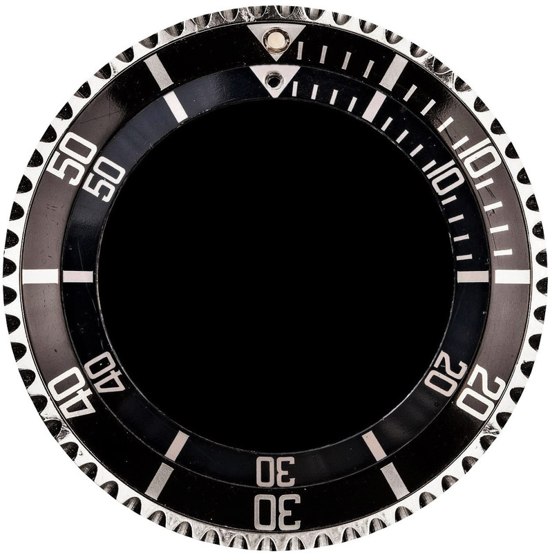
MK5.0 – HOOKED 5 (BASIC EDITION)
about 1967 - 1977 (1978)
black/silver, black/gold (ca. 1970 onwards), blue/gold, blue/silver (Tudor only, rough surface)
fig. 33: MK5.0

REMARK/S
Hooked 5 describes the look of the bow of the 5 with its pronounced serif, like a fishhook – in fact it’s the first square font version with strongly accentuated serifs; the “.0” sub-versioning points to its position as a basic edition, the explanation follows with the description of the MK5.1.
Comparison with MK4:
fig. 34: MK5.0 (outer) vs. MK4
CONSIDERATION/S REGARDING THE PERIOD
Starting point is the quick increase of findings from 1967 to 1968 to a continually higher level, matching the disappearance of the MK1; earlier relatively high numbers fall out of any consistency and are obvious replacement spreads only – not least as the version got used as service type for earlier watches for a long time, and additionally, for some years the fattest examples got erroneously accepted (and consequentially mounted on Subs) as “early MK1 kissing 4” for the 60s gilt era; during the mid-70s, the numbers are a bit irregular because of the weak statistical base (missing date code on casebacks and bracelet clasps, sellers wrote often “1970s” only); phased out in about 1977.
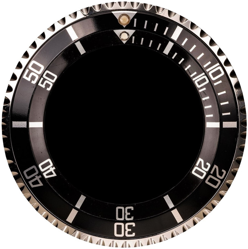
MK5.1 – HOOKED 5 (FIRST REMAKE), INCOMPLETE 4
about 1972 - 1979 (1980)
black/silver, black/gold, blue/gold, blue/silver (Tudor only, rough surface)
fig. 35: MK5.1

REMARK/S
First “hooked 5” remake, thus the numbering and label; obviously, the same template like for the MK5.0 got used for a new cliché (for the second production line); comes with several tiny etching-caused deviations/reductions and a more striking flaw – the incomplete 4, without the upper left part.
This version as well as the MK5.2 (which shows an incomplete 0) let me understand the making of clichés by photo-chemical etching, as only a repetitive use of one template for several clichés could explain those versions: if you remember the layout as an etched deepening in the cliché, an incomplete or reduced character cannot be wear, as wear cannot reduce the deepening or rather a contained character, only enlarge it – so, to find later the same layout/font with a faulty reduced character means the template got faulty reproduced on a new cliché; for in such a way affected versions (MK5.1, MK5.2, MILSUB), I imagine that the surface tension of the etching solution let a gas bubble stick in a corner of the character and avoid there the proper etching/deepening – subsequently, when using the cliché the dye couldn’t fill that area and thus not become adopted and transferred by the printing pad to the insert slug.
Comparison with MK5.0:
fig. 36: MK5.1 (outer) vs. MK5.0
CONSIDERATION/S REGARDING THE PERIOD
Noticeably increasing from 1972 to 1973 to a higher level, matches the fade of the MK4; earlier numbers appear as erratic replacement spreading; during the mid-70s, the numbers are a bit irregular because of the weak statistical base (missing date code on casebacks and bracelet clasps, sellers often wrote “1970s” only); the low percentage in 1976 seems randomly – note the unusually high number of MK8 replacements; dropped in about 1979.
MK5.2 - HOOKED 5 (SECOND REMAKE), INCOMPLETE 0
black/silver, black/gold, blue/gold, blue/silver (Tudor only, rough surface)
about 1977 - 1981
fig. 37: MK5.2

REMARK/S
Second “hooked 5” remake (same template like for the MK5.0/MK5.1, but an own cliché – see MK5.1 for an explanation) with an incomplete 0 (inside, right upper edge) of the 10, thus the numbering and the label; like with the MK5.1 we see also other, smaller differences, mainly with incomplete serifs on the 3.
Comparison with MK5.0:
fig. 38: MK5.2 (outer) vs. MK 5.0
CONSIDERATION/S REGARDING THE PERIOD
Low numbers – just a last, shorter living “hooked 5” series; I didn’t consider the findings in 1983 anymore because of the gap in 1982, and because such an excessive overlapping with the MK7 (of the assumed same second production line) would be strange; because of that gap I did also not add the option for a prolongation year.
MK6 – FUZZY 4
about 1978 - 1983 (1984)
black/silver, black/gold, blue/gold, blue/silver (Tudor only, rough surface)
fig. 39: MK6

REMARK/S
The label describes the fuzzy angulation on the back of the 4 as the easiest distinctive feature from other versions with either a sharp or no angulation above the left edge; the heightened font touches the bezel or goes (if fatter or shifted) even underneath.
Comparison with MK5.0:
fig. 40: MK6 (outer) vs. MK5.0
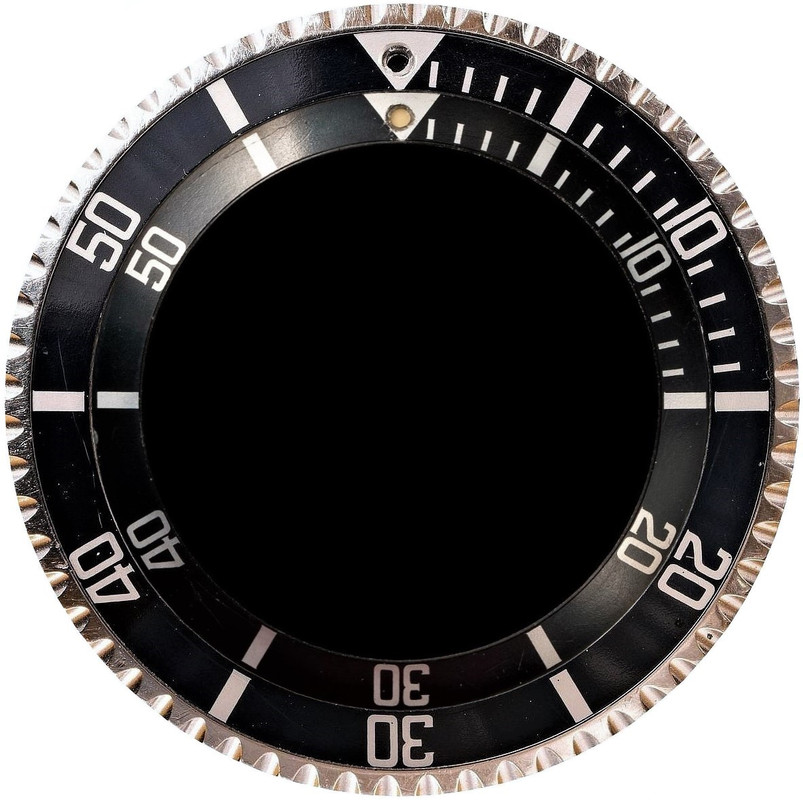
CONSIDERATION/S REGARDING THE PERIOD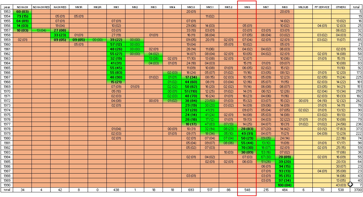
Increasing from 1978 to 1979 to a continually higher level; ran out in about 1983; there’s some indication that overstock got used into the 2000s for service up (in the 2000s supplied with Super-Luminova pearl, of course).
MK7 – STRAIGHT 4
about 1980 - 1985 (1986)
black/silver, black/gold, blue/gold, blue/silver (Tudor only)
fig. 41: MK7

REMARK/S
The label points to the straight back of the 4 as the easiest distinctive feature from versions with an angulation above the left edge; still a tall font.
Comparison with MK6:
fig. 42: MK7 (outer) vs. MK6
CONSIDERATION/S REGARDING THE PERIOD
Starting in about 1980, the straight back of the 4 goes along with the style of the inserts of the upcoming sapphire models; the last product of the assumed second production line, what suits the fading of diving watches of the acrylic era.
MK8 – FLAT 4
from about 1984 onwards
black/silver, black/gold, blue/gold, blue/silver (Tudor only)
fig. 43: MK8

REMARK/S
Flat 4 is related to the uniquely wide flat top of the 4; back to a common font size but significantly wider digits.
Comparison with MK7:
fig. 44: MK8 (outer) vs. MK7
CONSIDERATION/S REGARDING THE PERIOD
Increasing from 1984 to 1985 to a continually higher level for the remained Rolex acrylic era; earlier and sometimes high numbers are an unsurprising replacement spreading of this last, long-living and thus best available version.
MILSUB
about 1971 - 1979
black/silver
fig. 45: MILSUB

REMARK/S
Just to complete the big picture; with its famous incomplete 0 of 30 (for a possible explanation see the description of the MK5.1); for Rolex MilSubs only – not to confuse with Tudor MilSubs which got standard inserts; there is no other (like for services) variant; the period is common collectors’ knowledge.
FAT FONT SERVICE VERSION
Finally, I’d like to show a sample of how the statistic helped me to spot non-contemporary stuff; at first glance, this here looks pretty similar to the MK7:
fig. 46: FAT FONT SERVICE VERSION

fig. 47: SERVICE FF (outer) vs. MK7
So, you might believe in another 1980s version; however, if you check the statistic, its numbers of findings are not only low (not to confuse with low numbers of obviously way older and rarer versions) but also widely spread without any cumulation (which is inevitable for a contemporary version), thus a service part (at least for the Rolex acrylic era – maybe contemporary for post-1990s Tudors ref. 79090, which I didn’t verify):
SQUARE FONT VERSIONS COMPARISON/IDENTIFICATION CHART
If you’re not well experienced in recognizing font properties, it can be tricky to spot the small differences between similar square font versions – but the high-resolution chart below will enable you to identify any Mark by comparing all at a glance:
fig. 48: comparison/identification chart:

All characters are individual, only the MK5.x share some widely identical ones (for the reason see the description of the MK5.1); please remain cautious: to identify a version, a quick look is enough – but if you have any doubt in an insert, then review every detail; consider that in reality the font versions show individual sizes, and my samples might have tiniest printing/damage/shooting/revision particularities.
11 BACKS AND BORDERS
Except for the MK2R and the MK2, all versions have a three-step back profile with an upper, an angled and a lower phase (the dimensions of the phases or rather their relation to each other can vary):
fig. 49: standard back profile

On late versions sometimes not machined that smooth – then, the profile or rather the folds are less perceptible.
The MK2R and the MK2 show a special back with a two-step profile, with an upper and an angled phase only – a temporary, prototypical design:
fig. 50: special back profile of MK2R and MK2

Comparison:
fig. 51: special vs. standard back

The borders vary; as far as I’ve seen (but wear can change the appearance, and I cannot safely speak for any batch – so, take this as an indication only):
- the round font versions and the MK1R/MK1, MK3 and MK4 have a flat border
- the particular slug of the MK2R/MK2 has a sharp angle or rather an additional edge in the middle of the border
- all later versions show more or less beveled/rounded border edges, for an easier snapping (however, it’s possible that some early MK5.0 and MK5.1, as production successors of the MK1 and the MK4, got flat-bordered leftover slugs)
fig. 52: flat vs. angled vs. beveled insert border

A very thick flat border points to a cheap aftermarket item as those compensate weak metal with additional thickness.
12 LUME PEARLS
Starting with the last round font version HASH / RED TRIANGLE, all inserts (including the service versions) of acrylic Rolex/Tudor diving watches have the same small opening for the lume pearl – vertically, the position can marginally vary because of some drilling tolerance, and horizontally because of a shifted layout printing (remember, the latter got done on already drilled slugs); on those watches, inserts with a large opening and a metal-encircled pearl are either fake or, at best, modified.
Except for the earliest ones all lume pearls show the very same profile – and it’s not just a simple hemisphere (= aftermarket) but comes with initially few angled and almost straight, then increasingly bent sides and a slightly curved top:
fig. 53: lume pearl

fig. 54: lume pearl profile

This form avoids a cheap looking direct light reflection and is less exposed to wear.
The cavity for the lume is cylindrical, with a more hemispherical tip.
New and unpolished they show a milky surface with concentric cast grooves and a little step, but all that disappears quickly during the use; here’s a piece that got already a bit worn and thus clear, but you can still recognize its original shape and the rugged texture:
fig. 55: lume pearl with original shape and remained texture

Early executions looked different; seems, they played a bit with the shapes around – have seen rather pointed domes as well as pretty flat ellipsoids, like this here:
pic. 56: lume pearl in ellipsoid form

They were a bit rounded against the underneath and thus not resting on the metal as flat as the later ones (thus, exposed to get ripped off) .